
2023 Hack the Heights
Building a visual identity for BC's annual hackathon from scratch and making a traditionally technical event feel inviting to the rest of campus.
01
Background
The Problem
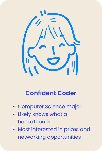
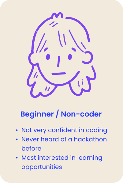
BC isn't known for its CS department, so one of our biggest challenges was simply getting enough students through the door. We had two audiences to reach: experienced coders and complete beginners. Our existing materials weren't speaking clearly to either.
Our Goal
Design for both: make prizes, schedules, and technical details easy for experienced coders to find, while making the event feel approachable to beginners and non-CS students.
Main Challenge
The identity had to work across every touchpoint — from the responsive website to posters, merch, social media, and sponsorship materials — so the event felt like a campus-wide initiative rather than a one-off event.
02
Brand System
Theme & Identity
Each year the outgoing co-presidents announce the theme for that year's hackathon. Since BC is often called "The Heights," we built the identity around reaching new heights — an outer-space theme.
Custom Illustrations
I developed a set of custom vector illustrations: a telescope, rocket, and satellite plus a large hero illustration of a rocket launching through stylized clouds. The goal was assets that could mix and reuse across many applications while still feeling cohesive.



03
Iteration
Designing Mobile First
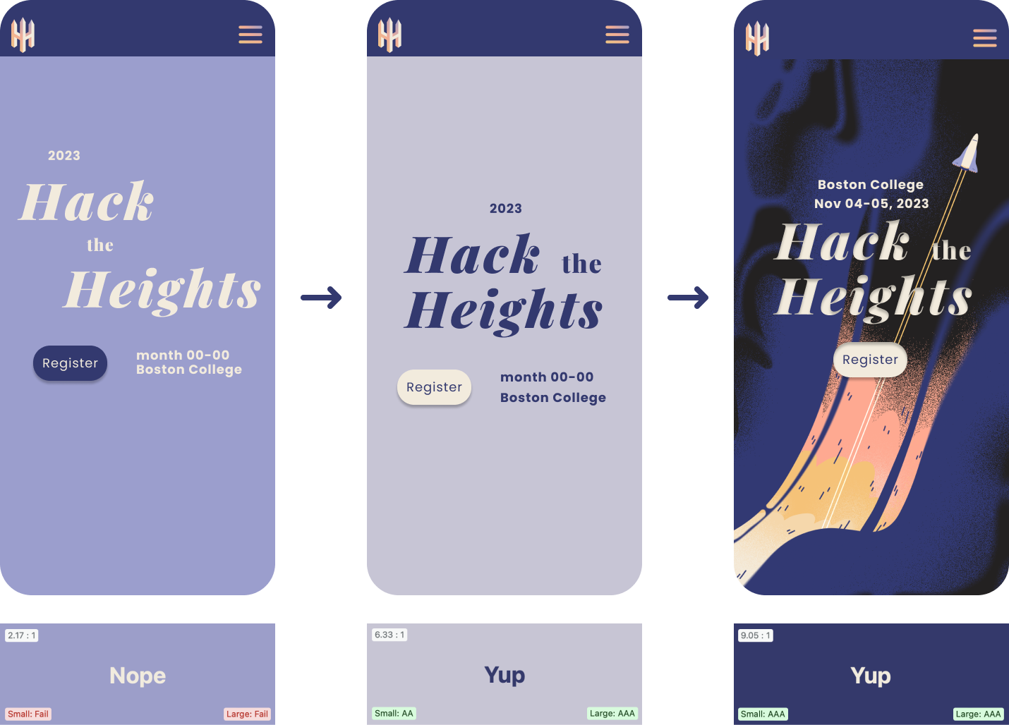
With a small student dev team building the site, I designed mobile-first: prioritizing the most important information on a smaller screen before expanding the system to desktop. Along the way I also caught and fixed real accessibility issues in my first colour pairings before handoff.
04
Launch & Touchpoints
Where It Shipped
One of my favorite parts of branding is watching a visual system leave Figma and show up in the real world. The identity eventually stretched across merch, event posters, social, sponsorship materials, and the website. Click any piece below to look closer; the site mockups scroll, so you can browse them like the real thing.
It was rewarding to watch attendees interact with a consistent identity across the whole event, instead of seeing each piece exist on its own.
05
Reflection
What I'd Carry Forward
Learning By Doing
This was my first time designing a full website in Figma. There was lots of trial and error, YouTube tutorials, and leaning on upperclassmen friends along the way. 🌱
Learning to Lead
It was also my first time leading an entire team on my own. As a sophomore working alongside students with more experience than me, I learned quickly that leadership meant being willing to speak up, take initiative, and keep things moving — even when I didn't have all the answers.