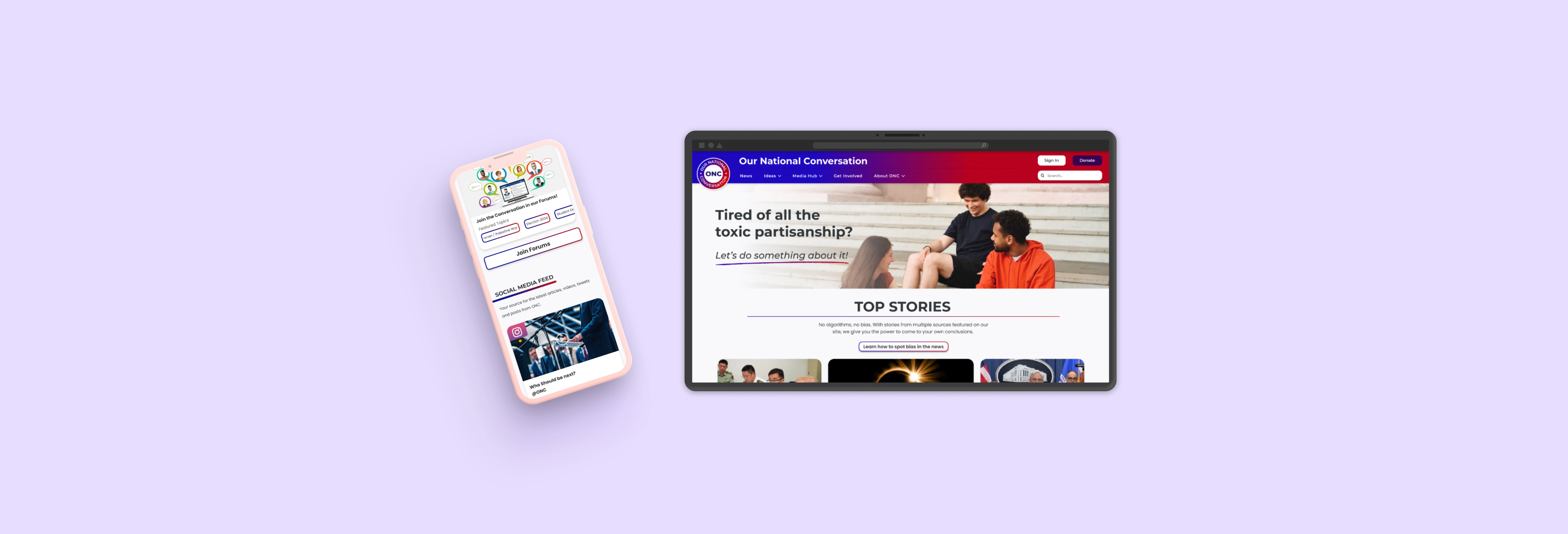
Our National Conversation
Confusing navigation was getting in the way of ONC's mission to make politics feel less hostile. This redesign fixed it.
01
Evidence First
Heuristic Evaluation & Usability Testing
ONC's old site had already been flagged internally as due for a redesign, but "it needs work" isn't a design brief. As one of four interns doing the hands-on redesign, guided by two leads pointing us toward research methods rather than dictating direction, our first job was to turn that instinct into evidence.
Heuristic evaluation first
We ran the old site against Jakob Nielsen's 10 usability heuristics, scoring each violation on a severity scale, cosmetic to blocker. This gave the team a shared, non-subjective language for what was actually wrong, before anyone started redesigning on instinct.
15 issues found: 3 cosmetic · 4 minor · 8 major
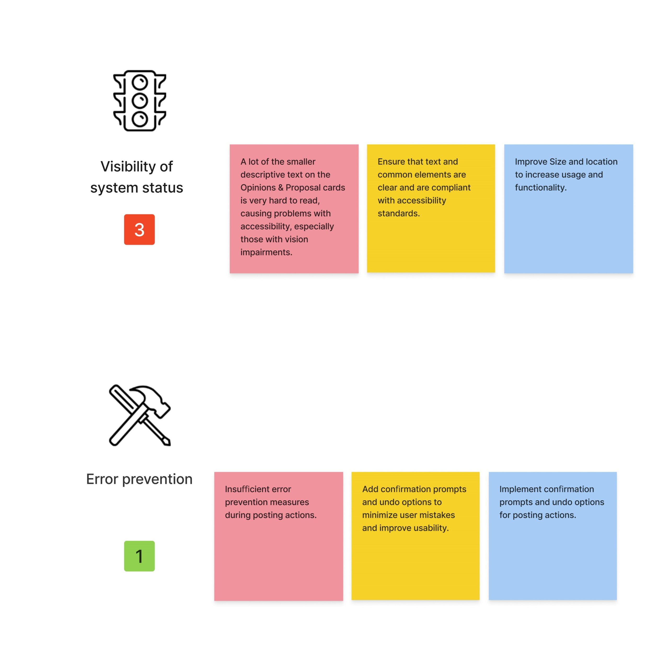
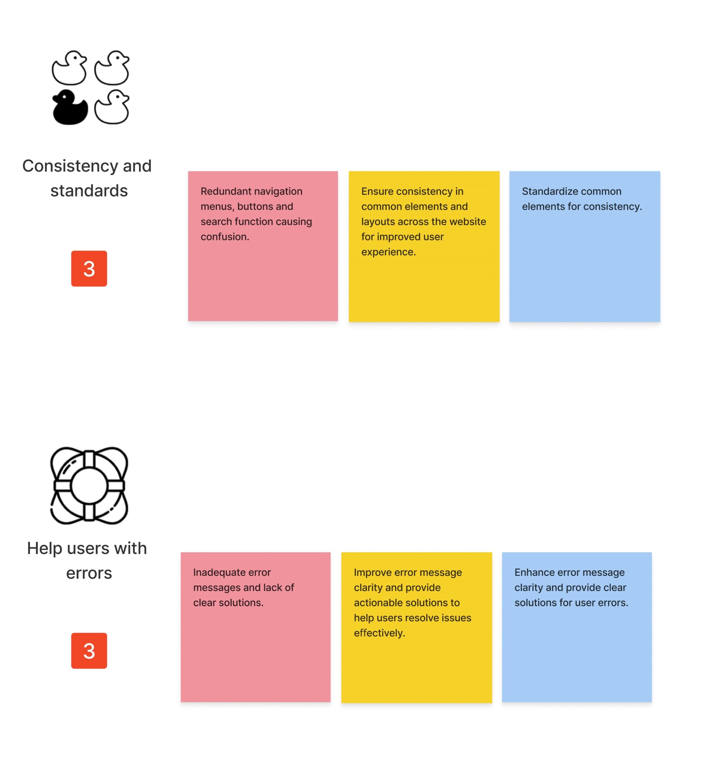
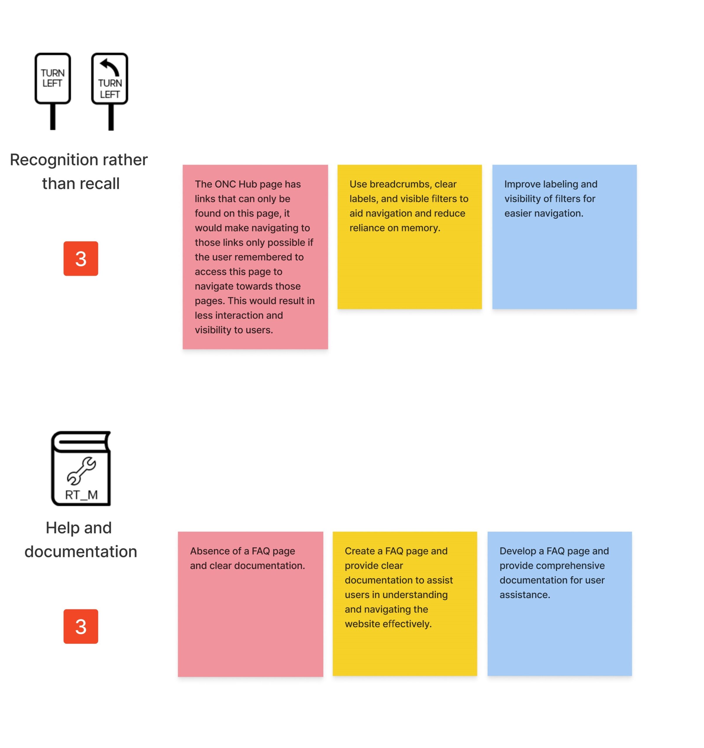
The major issues clustered around a few recurring problems: limited user control and flexibility, unclear navigation and menu structure, aesthetic overload, poor visual hierarchy, and a mismatch between the site's language and what users actually expected to find.
Usability testing validated it
We ran moderated usability sessions on the existing site to see whether those heuristic findings held up against real behavior, not just expert review.
"It's confusing to navigate." "There's a lot of text on the home page and it's a bit confusing."
The old site wasn't failing because of one broken page. It was failing because structure hadn't been built around what users were actually trying to do.
02
News Fatigue
Surveys & Secondary Research
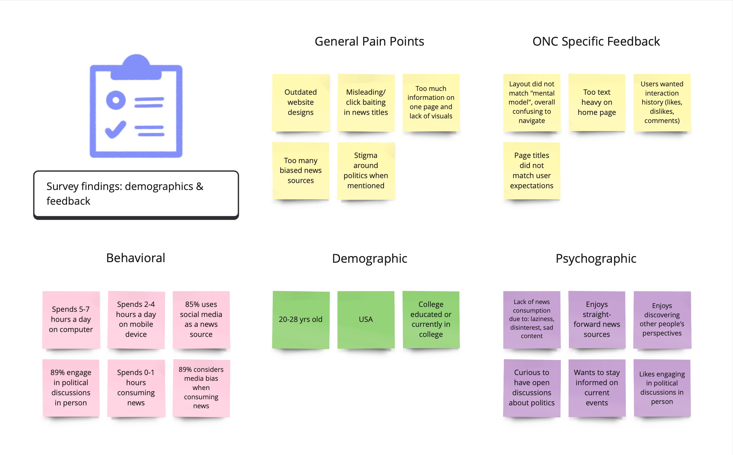
We surveyed 30 college students to get a direct read on the 20–35 target demographic.
Learning was the top motivator for following news (75%), followed by staying informed on policy and talking with friends and family (51% each). Most read less than an hour a day (64%), and wanted news that was straightforward and reliable, without the toxic debate that came with it.
Secondary research (Harvard's Institute of Politics, Hamilton College, and the Reuters Institute) confirmed the pattern held nationally: this age group shows lower trust in traditional outlets, wants broader and more genuine coverage of different perspectives, and increasingly reads digitally rather than through traditional media.
A case for mobile-first
Given how strongly this pointed toward phone-based reading, our design team made an early case to prioritize mobile rather than treat it as a secondary concern. It didn't set the final priority (more in Chapter 04), but it shaped how we argued for the audience throughout.
Where the competition falls short
We ran a SWOT analysis across five related platforms, Vox, BridgeUSA, AllSides, Starts With Us, and A Starting Point, to see whether ONC was offering something the field didn't already have.
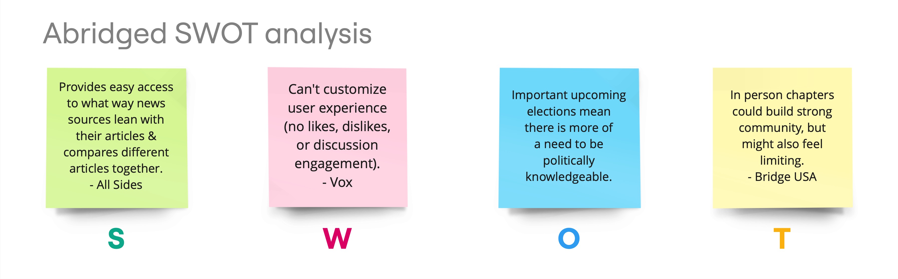
AllSides came closest to our own audience and educational value proposition. Our redesign had to make ONC's strengths show through where AllSides fell short.
The opportunity wasn't more information. It was a source young readers could actually trust. That understanding needed one shared shape the whole team could work from.
Personas & affinity mapping
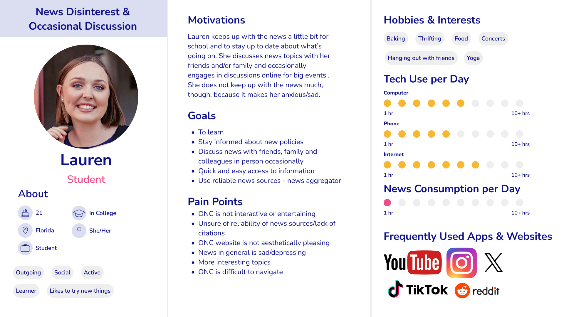
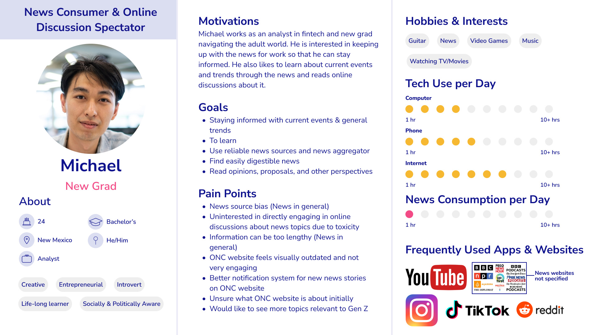
We built four personas from the research to bridge detailed findings and practical decisions, giving leadership and other ONC teams a fast way to understand who we were designing for. Two capture the range best: the News Consumer & Online Discussion Spectator, and News Disinterest & Occasional In-Person Discussion.
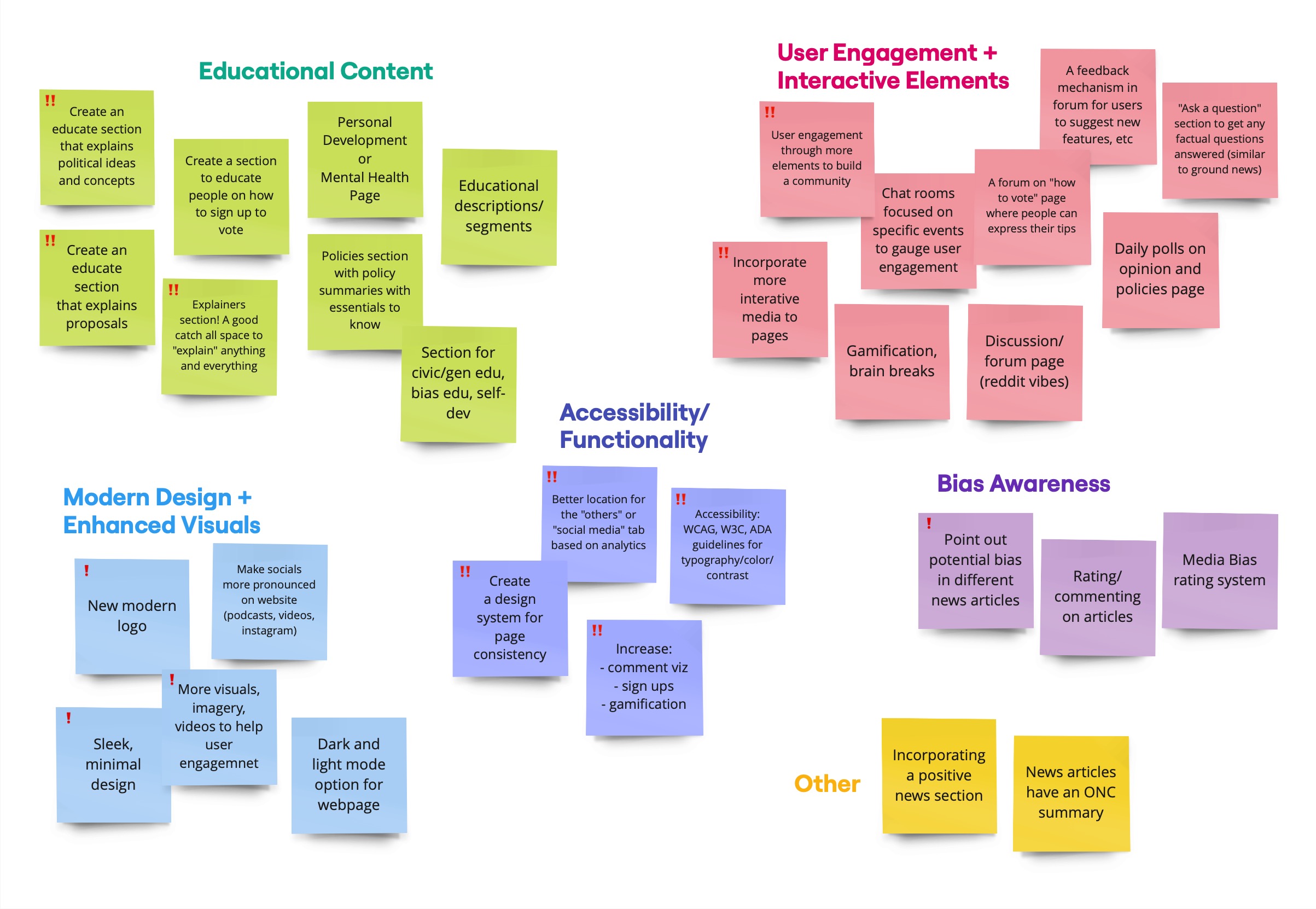
Not everything fit neatly into a persona. We used affinity mapping to sort the rest into three buckets: new feature ideas, design enhancements, and news-aggregator improvements, giving the team a head start heading into ideation.
03
Navigation Flow
Information Architecture
Navigation was the loudest complaint. So it went first.
We restructured ONC's site map to better match how users actually think, grouping content around News, Proposals, Opinions, and education rather than the old, flatter structure.
Four new sections came out of this pass: Forums for moderated discussion, Explain That for visual civic education, a Media Hub for ONC's videos and podcasts, and More for other ONC happenings.
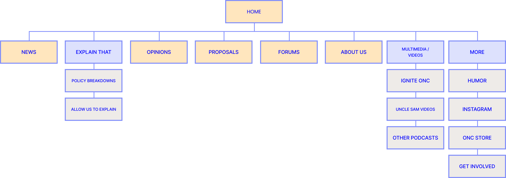
This flow was backed by a card sort with target users, since navigation had been a real pain point in the old site and getting the new structure research-validated mattered before a single screen was drawn.
Refining the site's structure gave every later design decision a foundation to stand on.
04
Iterating
Mid-fi to Hi-fi
Wireframes and mid-fi prototypes came first, focused on an organized, modern layout with smaller text and more intuitive grouping.
We started with the homepage, tested it at mid-fidelity, and used it as the template the rest of the site would inherit.
Iteration continued across every page from there. Mobile prototypes were built alongside the desktop designs, and both shipped together, though desktop stayed the priority throughout, a call made above the design team despite our earlier case for mobile-first.
Across the six-person team, I led the redesign of Proposals, Opinions, and News specifically. Other pages, like Home, were a shared effort across the whole team.
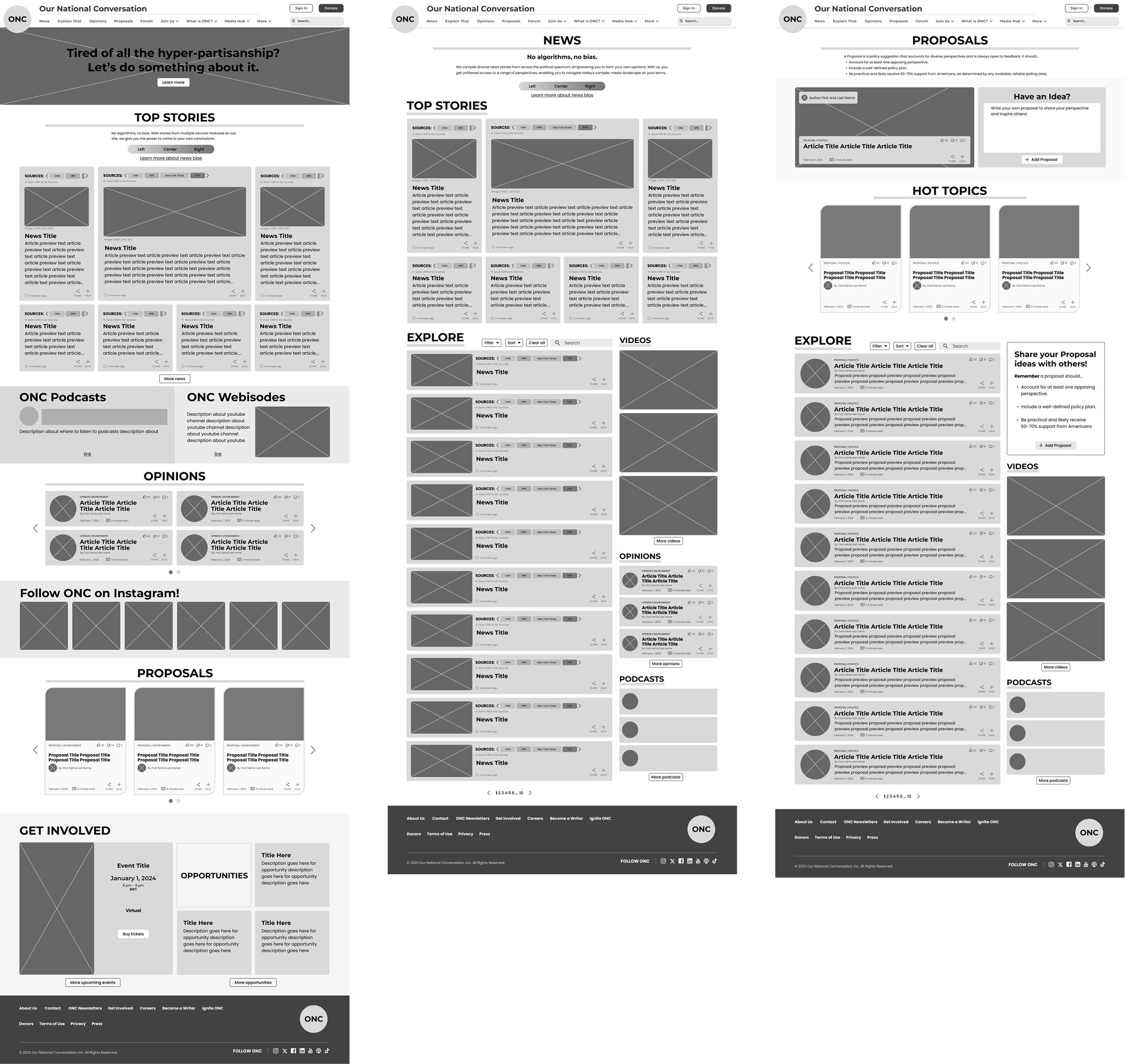
From there, the Proposals page went through three real hi-fi iterations, each one a direct response to a specific critique, not just a polish pass.
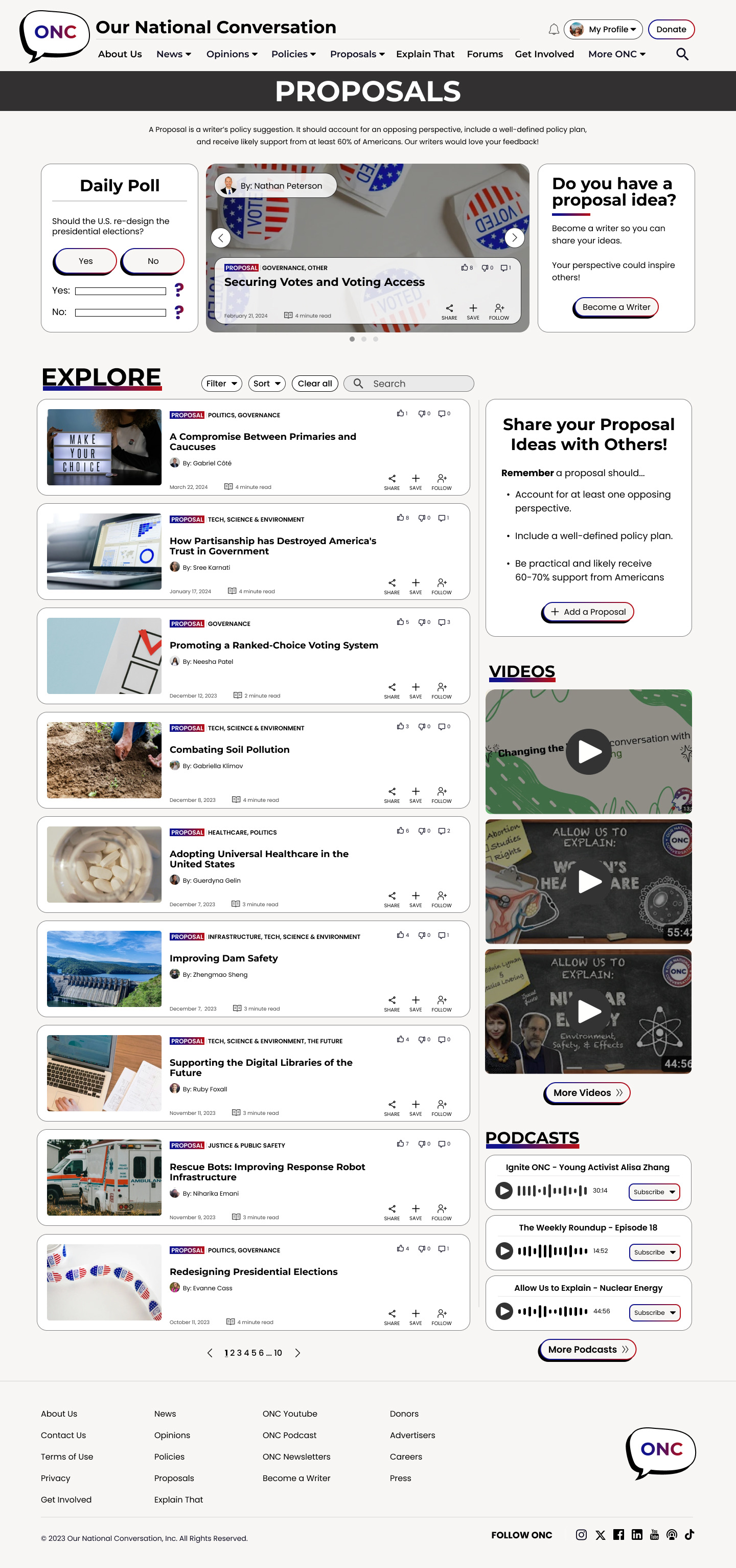
ver. 1
Cleaner overall, but still had redundant sections asking users for proposals twice.
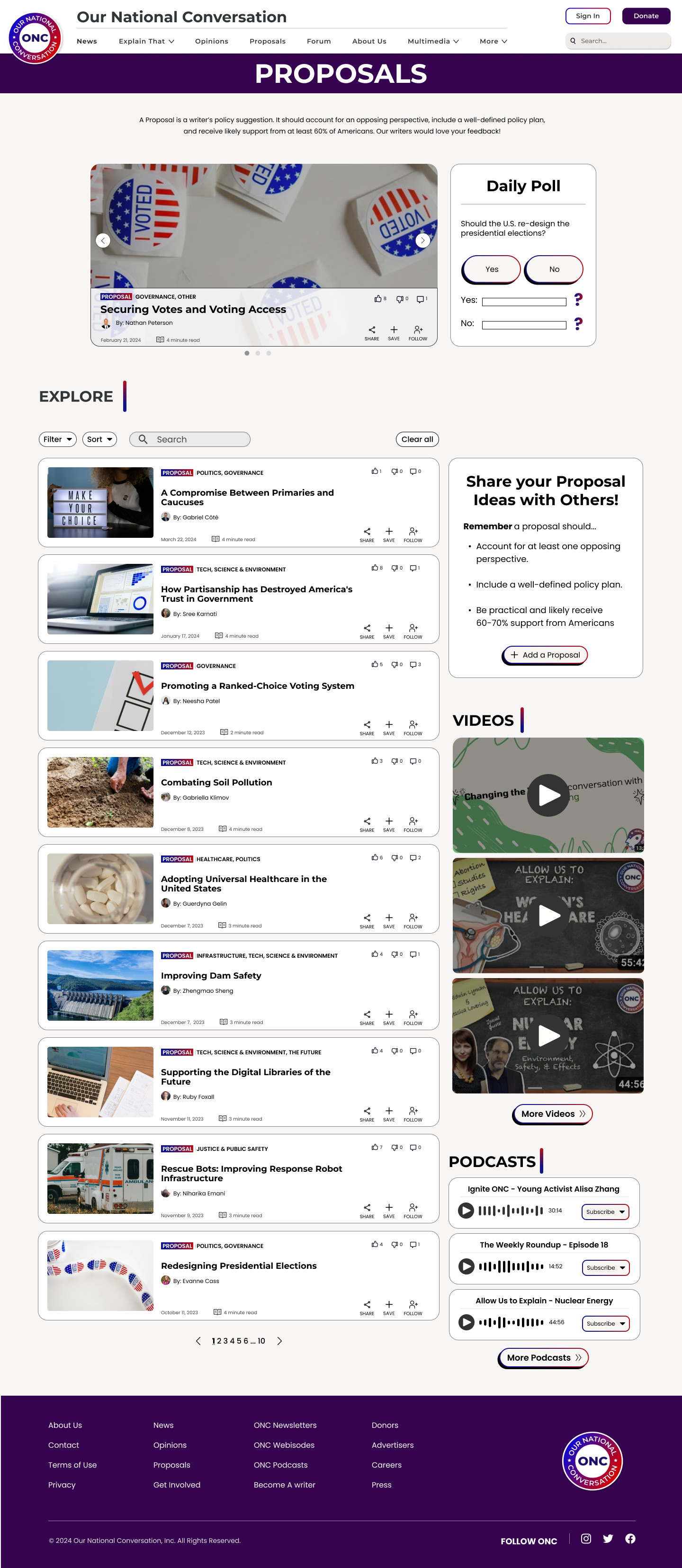
ver. 2
A more serious logo and heavier accent color, but tight article boxes hurt visibility.
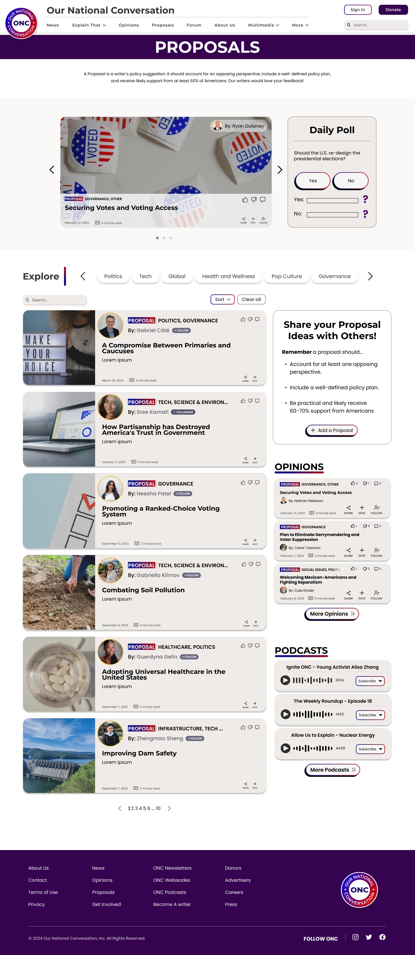
ver. 3
Enlarged article boxes and author photos, using color to group content and connect readers with writers.
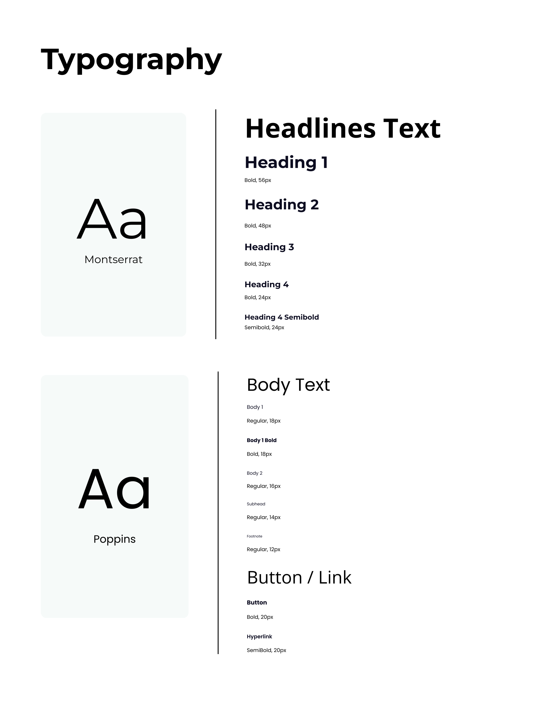
A style guide and mini design system followed, applying Gestalt grouping principles for easier at-a-glance browsing.
05
Validation
Two Rounds of Testing
Two rounds of usability testing checked whether the redesign actually worked, not just looked better.
Round 1 · Homepage · 5 participants
100%
Rated the redesign more trustworthy
+80pts
Jump in mission comprehension
60→100%
About-page nav success rate
"I really like the bento box layout. I think the news aggregator is cool with the different sources available."
Round 2 · Content Pages · 5 participants
100%
Rated the site modern & easy to use
+60%
Improvement defining "Proposals"
+30%
Overall satisfaction vs. round 1
Feedback wasn't universally glowing: some didn't expect the podcast dropdown, and a few weren't sure if Explain That content was user-submitted. Stakeholders separately asked for a shorter nav and stronger brand color.
06
Final Impact
Design System & Handoff
A style guide and mini design system kept 18 pages consistent and WCAG 2.1 compliant. I kept the component library clean throughout and built several components myself.
As the only team member with a CS background alongside design, I was also the main point of contact with development through handoff.
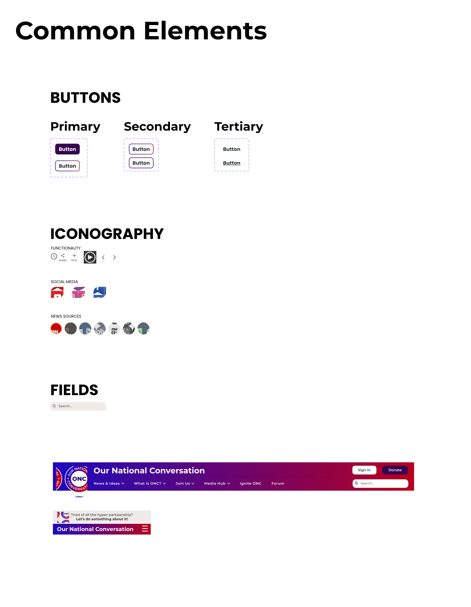
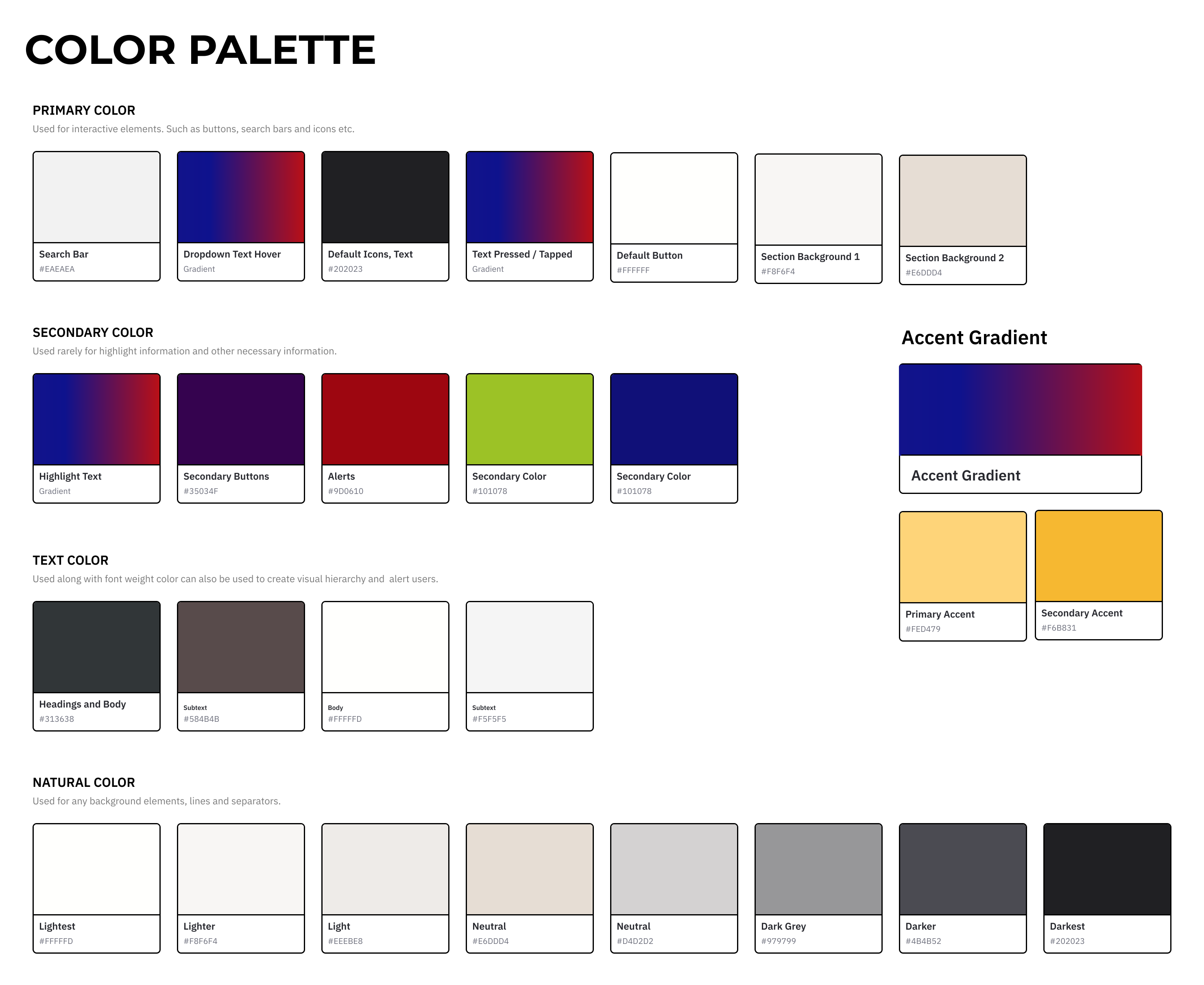
We resolved 9 of the 15 original heuristic issues. Final designs folded in the shorter nav and brand color stakeholders asked for, plus removed redundant sections and ad spacing.
07
Reflection
What I'd Carry Forward
Broad to specific
If I restarted this project, I'd begin with secondary research and market context before primary interviews: broad to specific, not the reverse.
I wish we'd led with mobile
We made the data-backed case for mobile-first, but desktop stayed the priority throughout, even though both shipped together in the end. I still wish mobile had led the process instead of running alongside it.
Internal and external signals don't always agree
Balancing stakeholder vision against usability data took real negotiation, not just presenting findings. Ad placement was a good example: we had to position ads so they met business requirements without disrupting the experience we'd just spent two rounds of testing validating.
Accessibility benefits everyone, not just some users
Improving contrast and keyboard navigation for accessibility compliance ended up making the site easier to use for every participant we tested with, not only the users it was technically required for.