
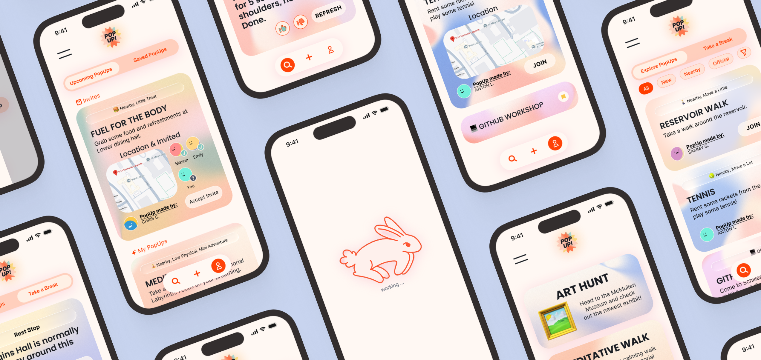
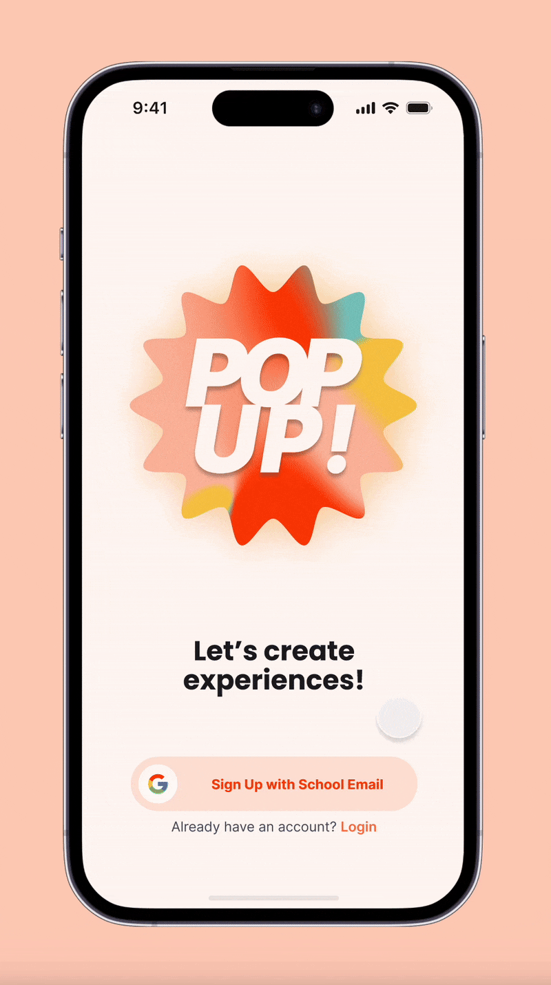
Students want small, meaningful moments without the friction of planning or digging through long event calendars. PopUp delivers instant micro-activities tailored to mood and location, turning campus events into simple, accessible prompts that fit anywhere.

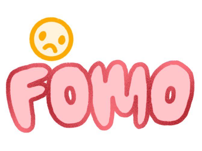
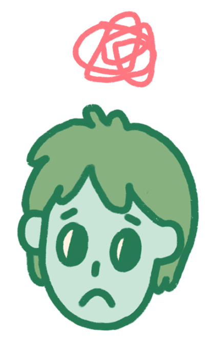
At Boston College, both on-campus and off-campus students experience social disconnection as their days are broken into small, unpredictable moments. With campus life centered around residential proximity, opportunities to engage often bypass students who are between classes, off campus, or low on energy. This makes it harder to feel part of the “BC bubble,” even when students want to participate.
By generating quick, context-aware activities based on time, mood, and location (while presenting campus events in a localized, approachable way), PopUp makes it easier for both on-campus and off-campus students to feel connected, even if campus life doesn’t neatly fit into their day.

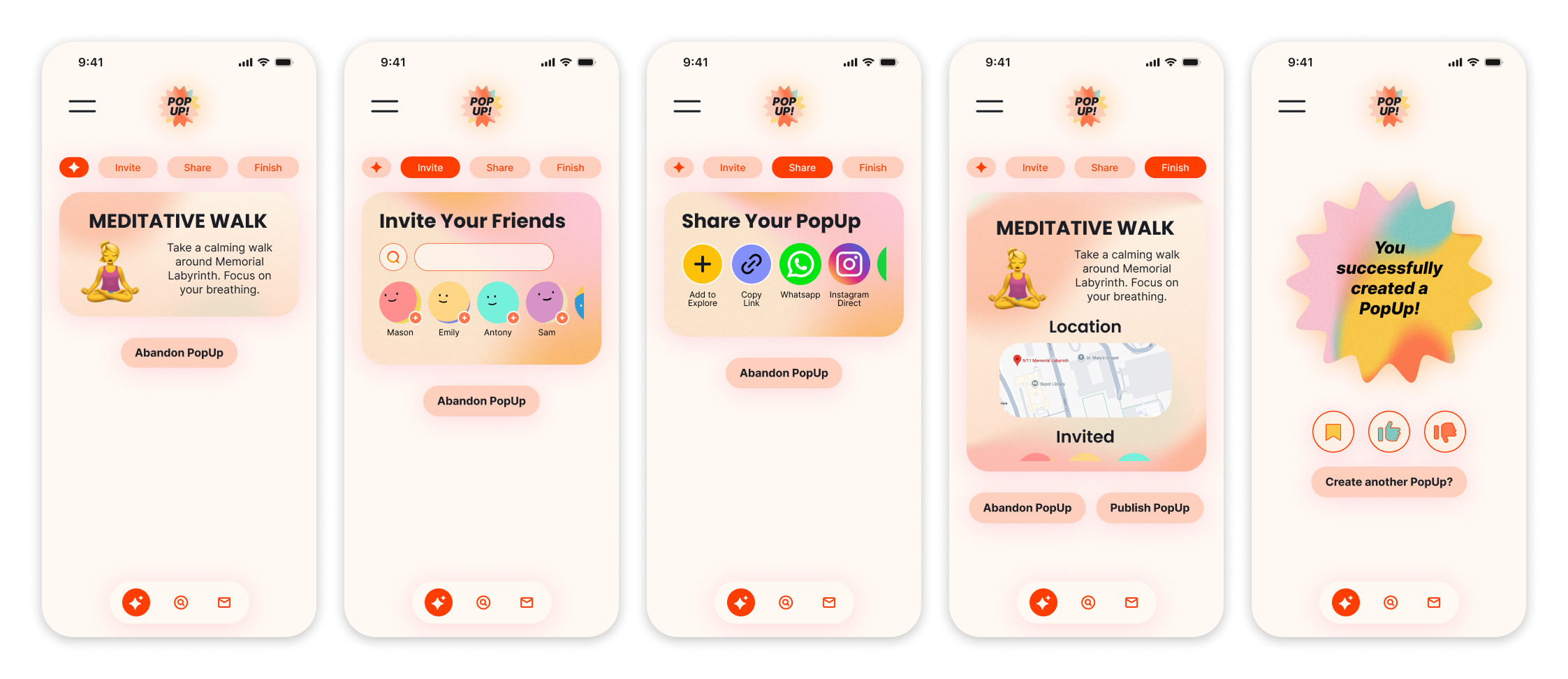
PopUp helps students turn small pockets of free time into meaningful moments. By applying filters or letting randomness take the wheel, users can making it easy to create plans without the mental load of full-fledged planning.
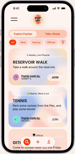
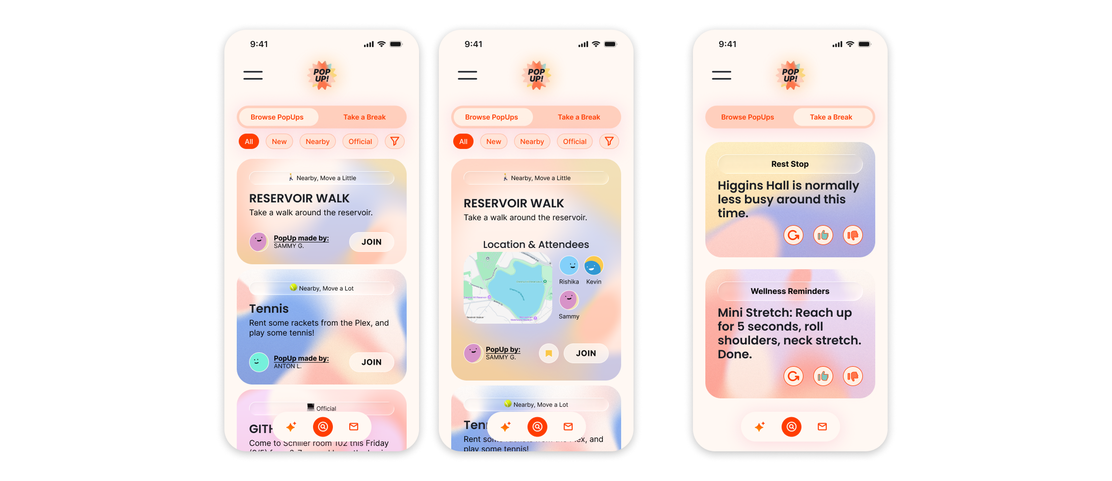
The Explore page lets users discover nearby PopUps and official events. Whether they’re looking to join something quickly or just see what’s up, browsing encourages low-pressure participation.
Users can also swipe to access rest spots and wellness recommendations.
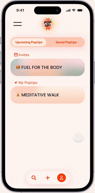
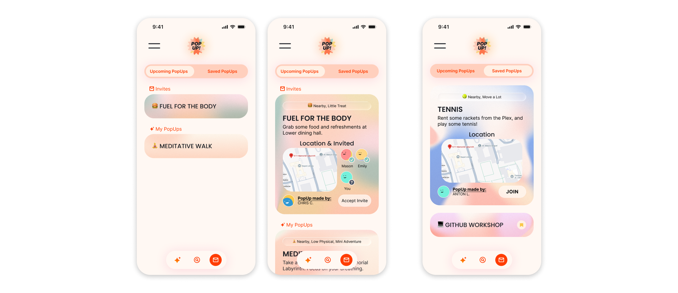
From pending invitations to saved PopUps, the profile view gives users a clear overview of their activity. This hub helps students keep track of what they’ve created, joined, or bookmarked without overwhelming them with notifications or clutter.
Rather than starting with a single user group, I began by researching the broader ecosystem of stakeholders who could be impacted by or interested in a campus social tool.
To understand how influence and incentives differed across these groups, I organized stakeholders into a power vs. interest matrix.
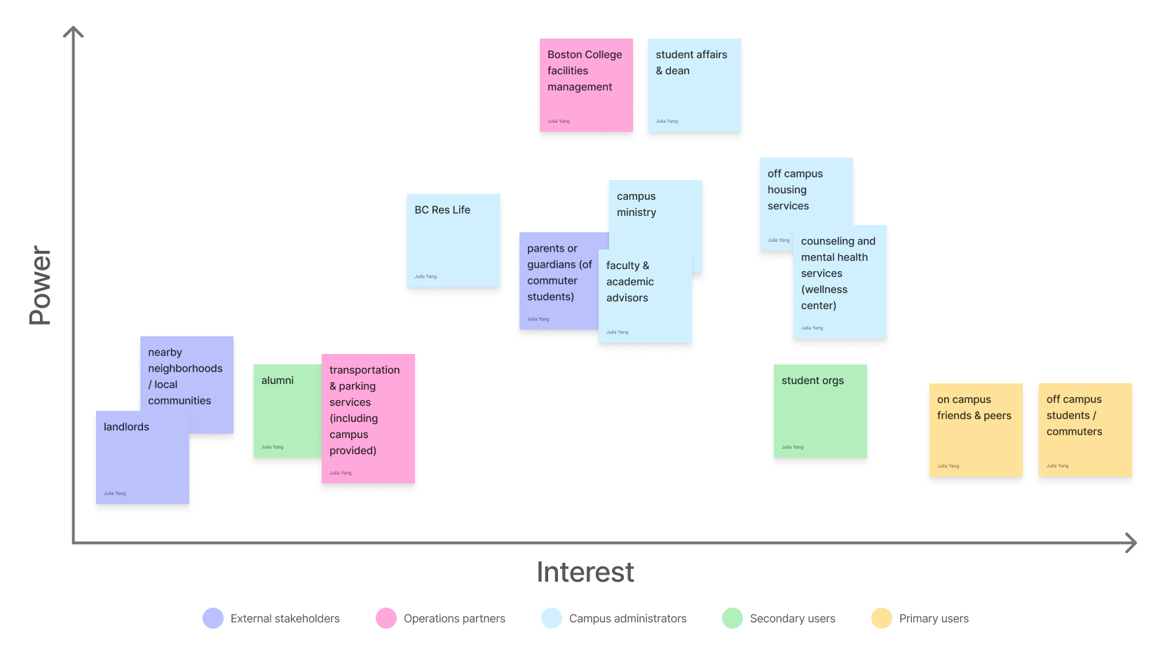
This framing helped define an early constraint: the product needed to succeed with students first, while still remaining compatible with institutional goals.
Through stakeholder mapping and early exploratory conversations, off-campus students consistently surfaced as experiencing the most friction. Compared to their on-campus peers, they were more likely to:

Prioritizing off-campus students clarified the value proposition without shrinking the market. If PopUp could work for students with the highest barriers, it would naturally work for those with fewer.
~ 40% currently living off campus
~ 60% living on campus but with prior off-campus experience
This mix allowed me to capture both current and reflective perspectives on off-campus life.


To complement user research, I created two stakeholder personas representing groups with high influence over campus life but different incentives than student users. These helped define my product constraints.


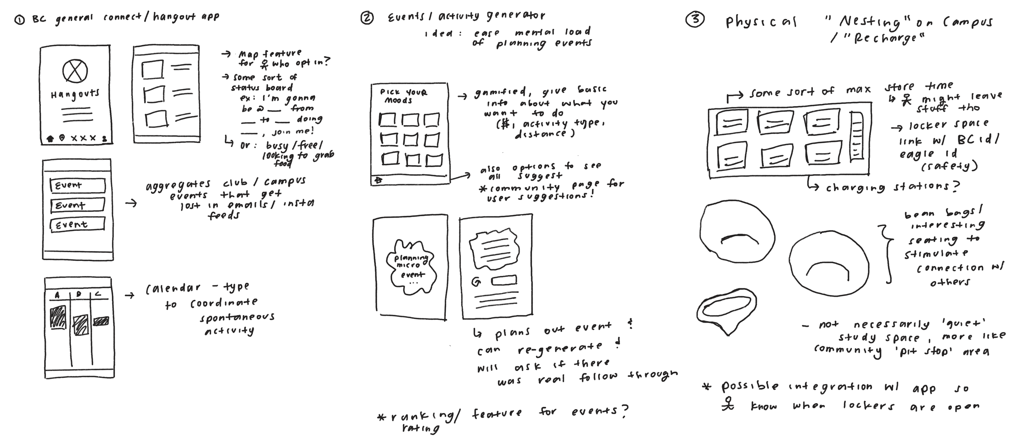
After defining the problem space, I brainstormed 30+ potential solutions spanning digital tools, physical interventions, and hybrid experiences. I then grouped these ideas into themes to identify distinct product directions rather than incremental feature variations.
From this process, three concepts emerged as the strongest candidates:
To move beyond intuition, I used a Pugh chart to compare the three concepts against a my university's Wellness Center as they offered both a physical rest location and wellness counceling. Each concept was scored from –3 to +3 across weighted criteria aligned with user pain points and project constraints, including:


This framework allowed me to balance user impact, feasibility, and scope realism in a structured way.
Elements of the “BC Connect” concept were retained where they supported discoverability, but the focus shifted toward contextual, low-pressure moments of connection.
This decision led to PopUp — an event generator designed to help off-campus and commuter students find spontaneous, low-effort ways to connect, especially during in-between moments.
I sacrificed long-term scalability of a physical concept to validate a faster, lower-risk digital product.
After selecting the Micro Event Generator as the product direction, I moved quickly into design with a focus on speed over polish. Given the short project timeline, my goal was to get a testable MVP in front of users as early as possible.
I began with low-fidelity, “paper” wireframes to explore core flows and validate the concept without committing to visual details.
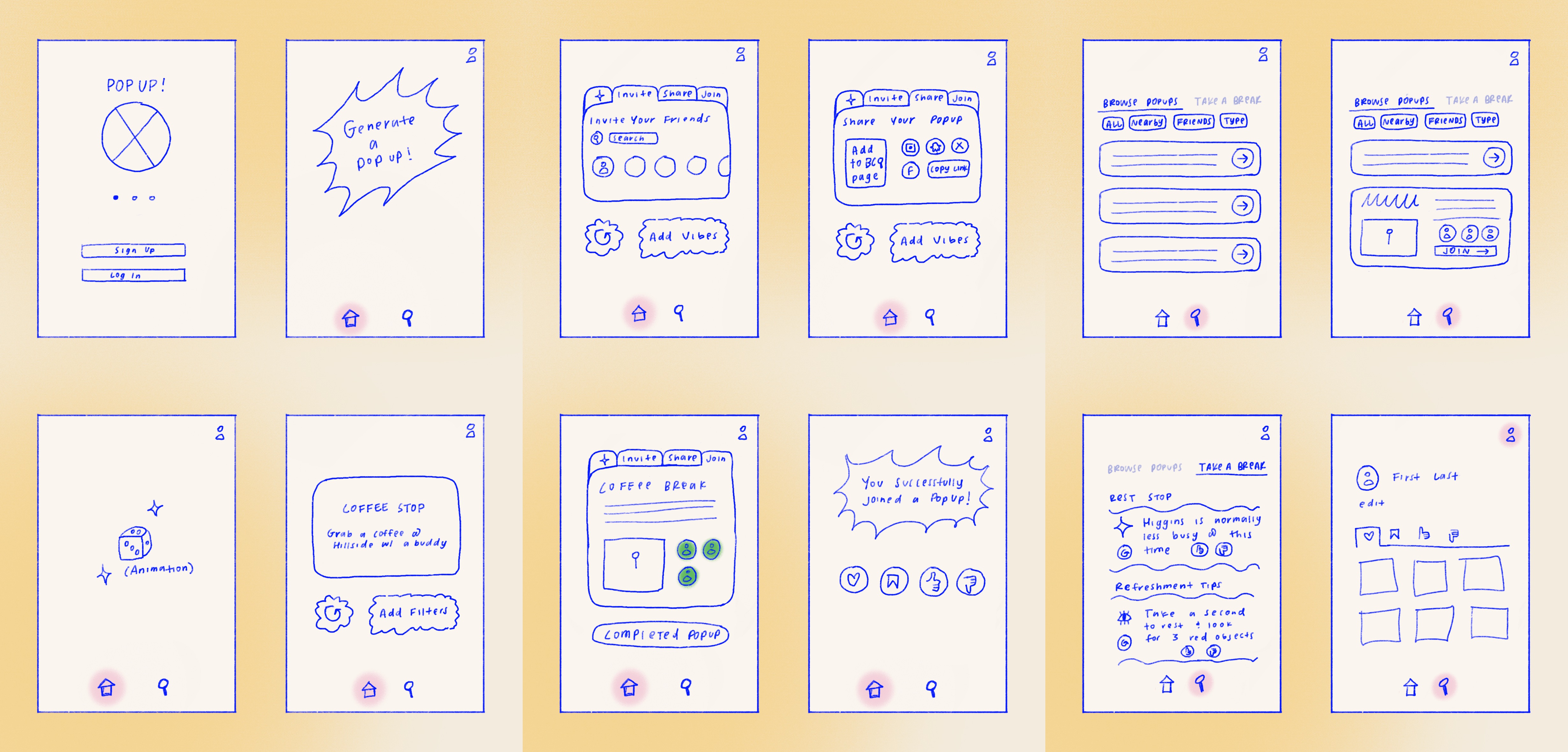
Once the basic structure felt sound, I translated the sketches into a mid-fidelity Figma prototype. I intentionally limited scope to core functionality to preserve time for testing and iteration.

I conducted usability tests with a few target users to validate whether the core concept and flows matched real user expectations. Each session lasted 5–7 minutes and followed a guided walkthrough using the prototype.


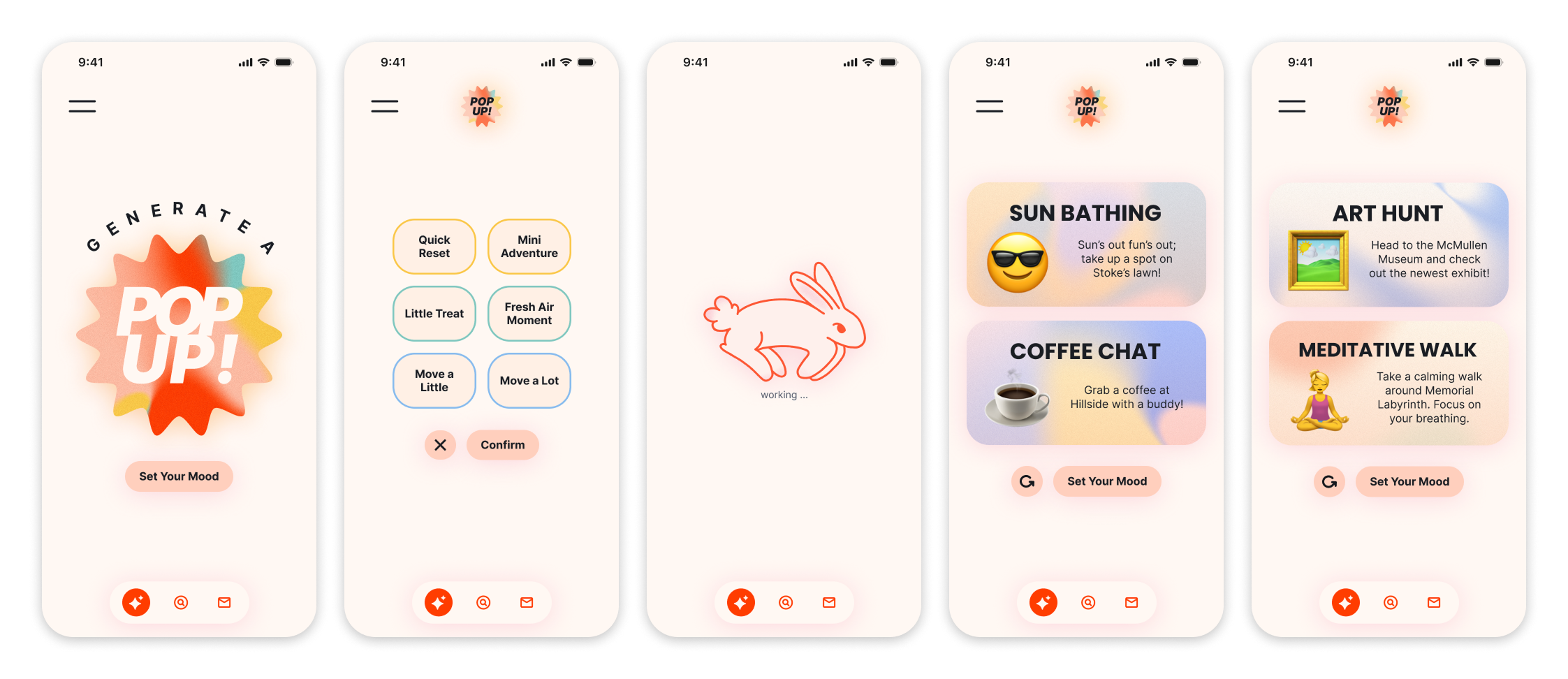
Guided by insights from user testing, I created the first iteration of the high-fidelity prototype in Figma.
Following the first high-fidelity iteration, I conducted a second round of usability testing to evaluate whether recent design changes actually reduced friction.
Each session began with a short script explaining the purpose of PopUp and setting expectations that the product—not the participant—was being tested.
Users were then given some time to freely explore the app, followed by realistic, time-pressured scenarios consistent with earlier frictions.

Using the feedback gathered from usability testing, I grouped participant responses into thematic clusters to better understand usability strengths and key friction points. This synthesis combines measurable outcomes with direct user sentiment, allowing patterns to emerge beyond individual sessions.


I redesigned the iconography and interaction states to provide clearer visual feedback, including distinct filled vs. outlined icons and adding text when necessary.
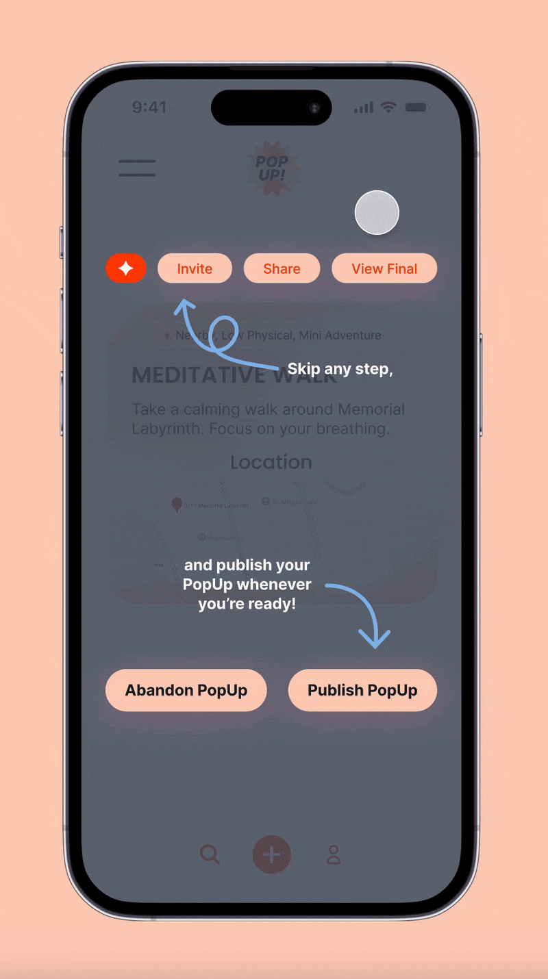
I introduced a lightweight tutorial overlay that appears only for first-time users, highlighting “skip” actions without interrupting the flow.
I made the Explore page the default home screen and repositioned PopUp generation as an action users enter when they’re ready to create, rather than the first step upon launch.
Usability testing revealed early friction around navigation, icon clarity, and flow expectations, suggesting that a dedicated onboarding experience could meaningfully improve first-time usability.
Without time for additional testing, I intentionally avoided shipping a full onboarding flow, given its impact on user comprehension and retention.
Instead, I focused on the above redesigns to address immediate usability issues without overcommitting to untested assumptions.
In early iterations, I realized it’s easy to get caught up in adding extra features or polishing minor details. By prioritizing a functional MVP and simply "making something exist" helped streamline the iteration process.
Design decisions are only as good as the data backing them. By grounding each change in qualitative and quantitative research, I avoided wasting time and building features that seemed cool to me but weren’t actually useful, which helped maintain focus on usability, discoverability, and engagement.
The playful visual identity and rabbit artwork helped establish engagement and recognition, but the core product needed to feel intuitive first. Learning to balance my time between aesthetics and function ensured the app was both fun and usable.
Looking ahead, I would expand PopUp by designing and testing a full onboarding experience, exploring deeper customization during PopUp creation, and defining how event generation could work for official organizations.


