
Boston Productions Inc
Designing gameplay you can't see the finish on.
01
Designing for a Space, Not a Screen
Accessibility & Constraints
Museum exhibits don't follow the usual UX playbook of market research and personas. These projects required close coordination with interior designers, architects, and physical prototyping teams — every digital interactive had to integrate into sightlines, visitor flow, accessibility needs, and tactile elements before a single screen was designed.
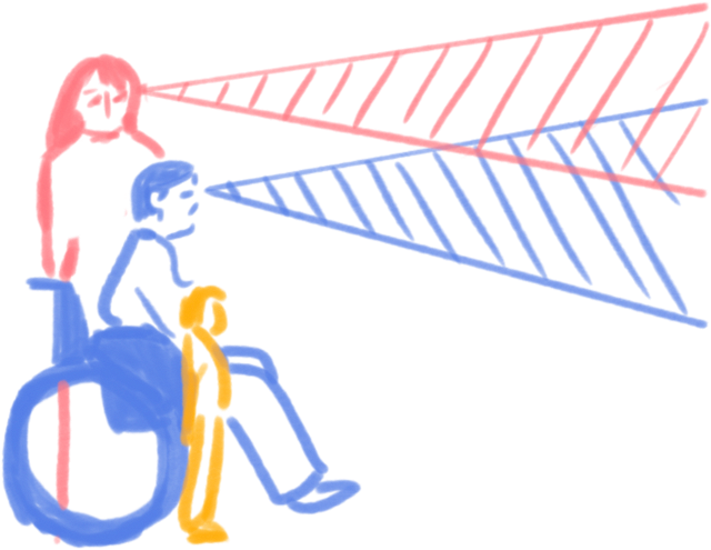
Since the size and mounting height of the final touchscreens were already set, I knew exactly where interactive elements needed to sit. I kept most visual features above a fixed reach line and made sure every functional element fell below it — within reach of visitors of all heights, including wheelchair users.
02
Function Before Finish
Process & Iteration
With historical research from BPI's content team as a foundation, I built game flows for both Carrier Clash and Stop the Tokyo Express — mapping every branching decision, trigger, and outcome so developers and stakeholders could see the full system at a glance.
Both games ran on the same one-week sprint cycle, in parallel, each through seven rounds of iteration driven by direct client feedback — starting from my mentor's rough sketches and ending in the fully mapped flows below.
Both games actually started with a moodier, photo-textured treatment visible below in each game's v1.2. I moved to monochrome by v2 on purpose: color and polish this early invite clients to react to aesthetics instead of testing whether the mechanics actually work.
Game flow
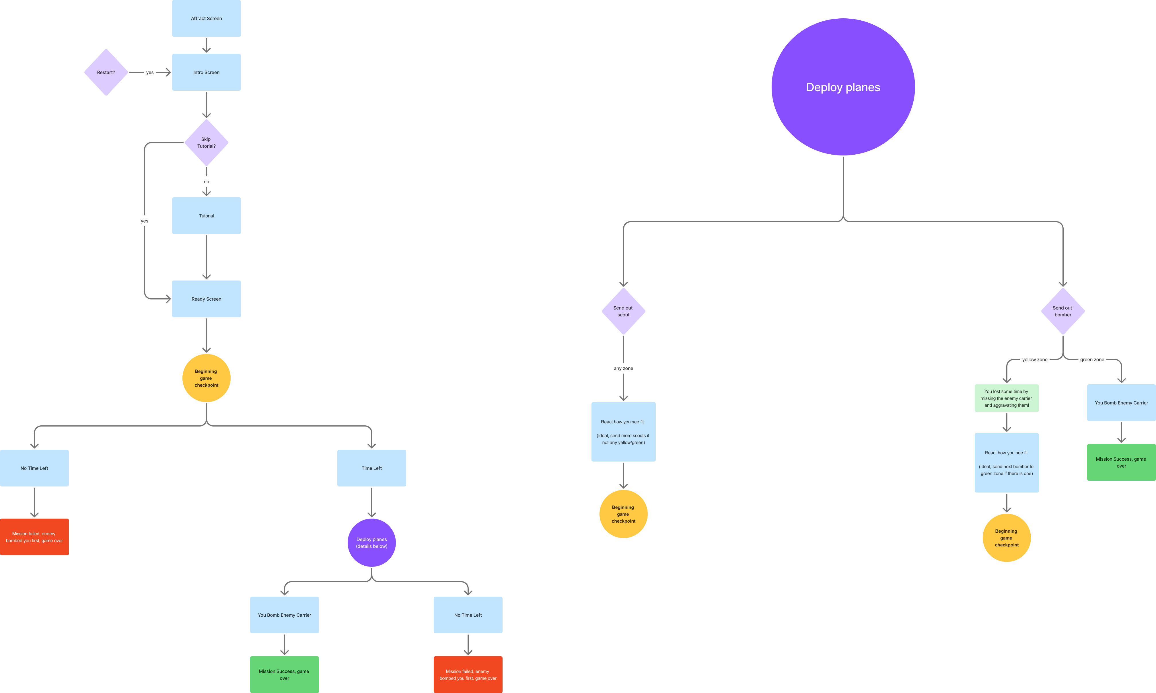
Full flow — v3.3 (latest)
Tutorial Loop
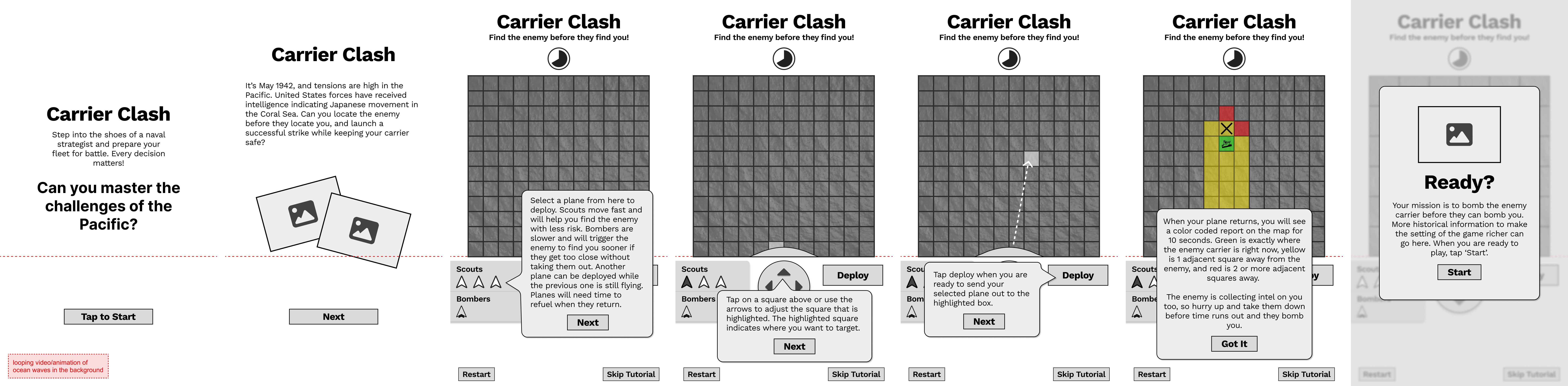
Scroll to see all 7 screens →
Game Loop

Scroll to see all 16 screens →
Results & Overlays
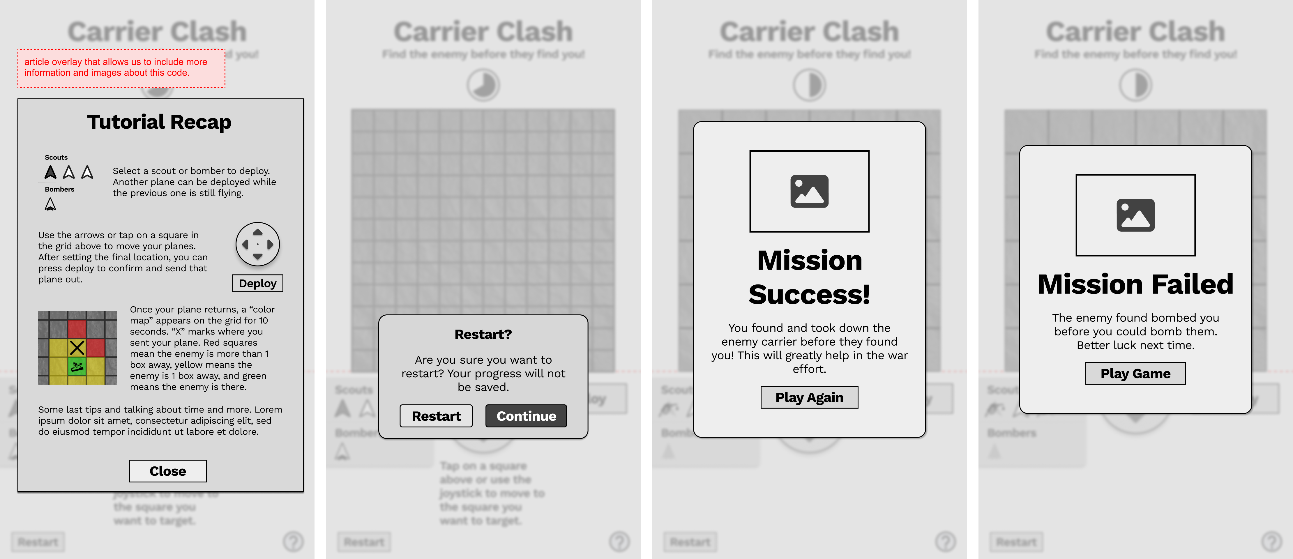
Scroll to see all 4 screens →
What changed
ver 1.2
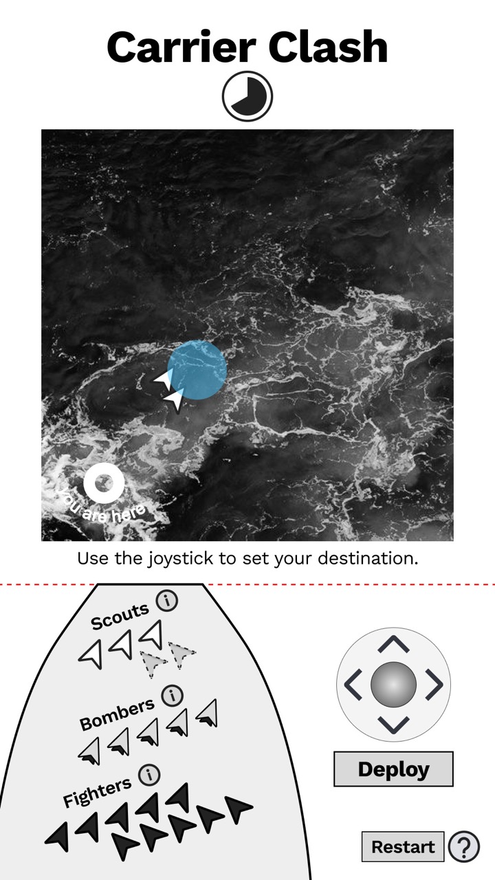
Tried photoreal, then dropped it for monochrome.
ver 2.1
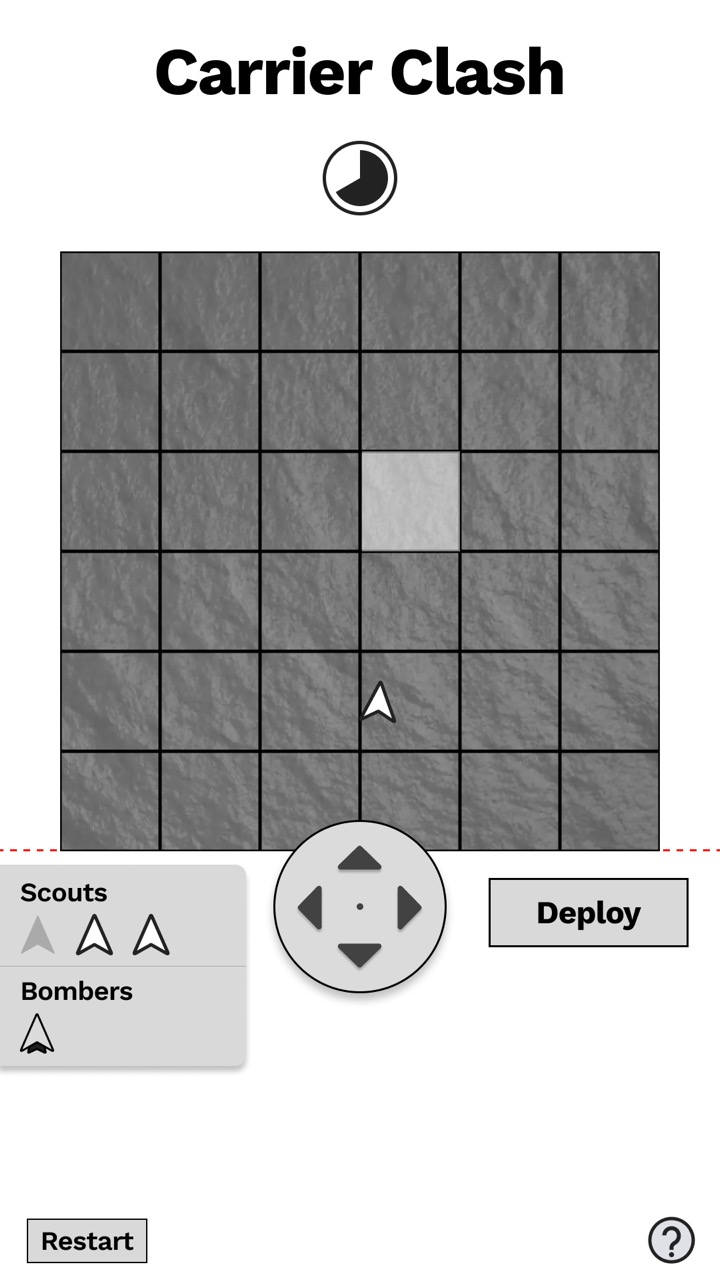
Fighters cut for historical accuracy — 2 unit types instead of 3.
ver 3.3
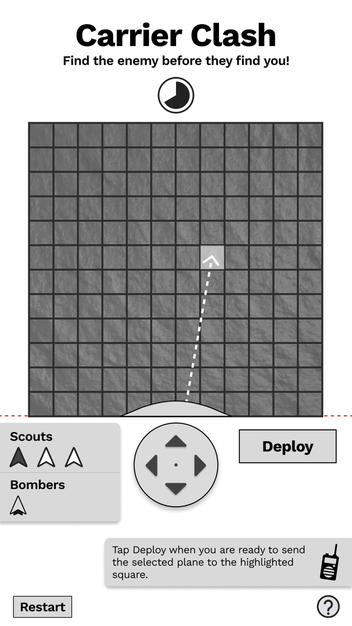
Dashed targeting line + instructional copy added for clarity.
Game flow
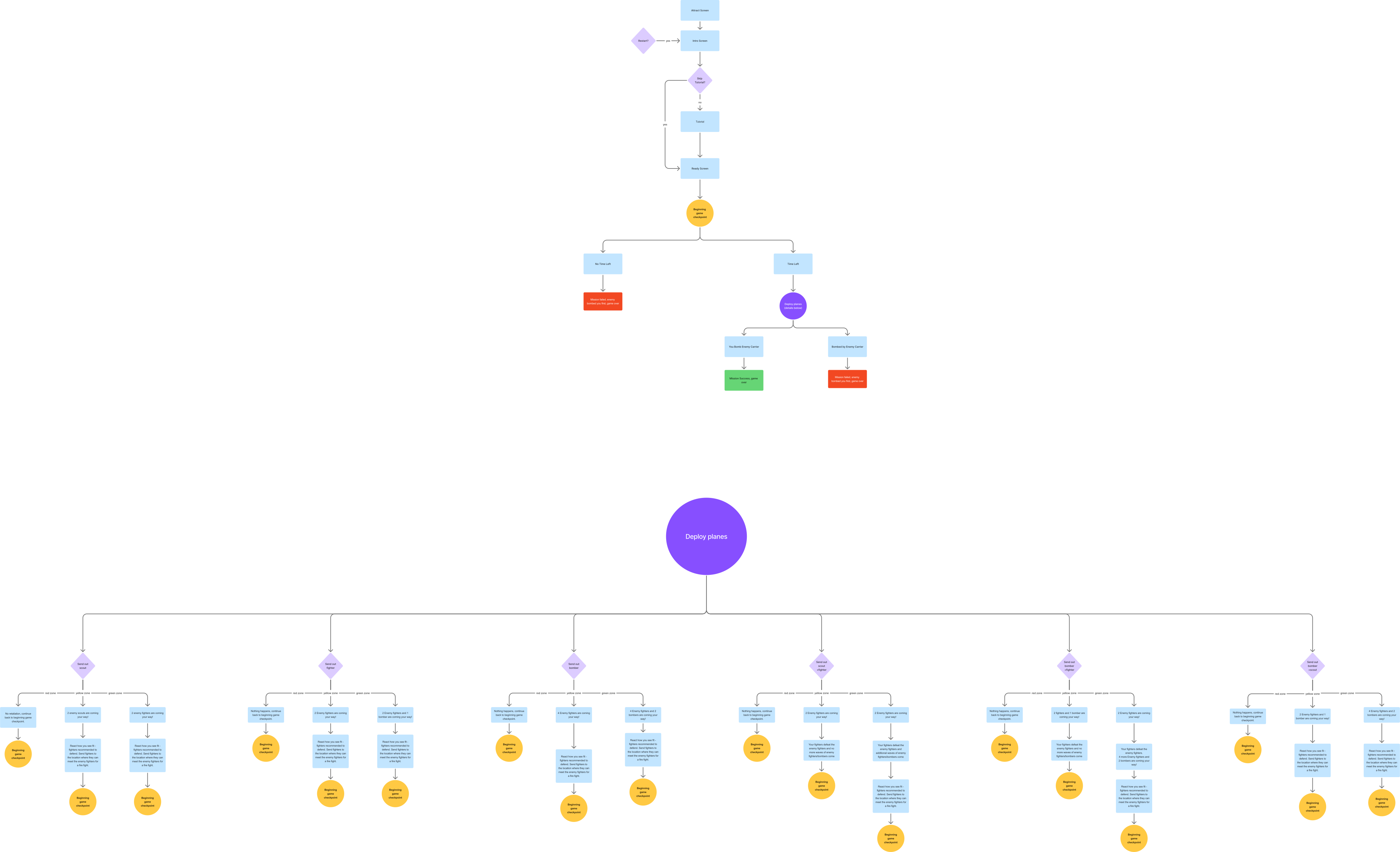
Full flow — v3.3 (latest)
Tutorial Loop

Scroll to see all 8 screens →
Game Loop

Scroll to see all 21 screens →
Results & Overlays
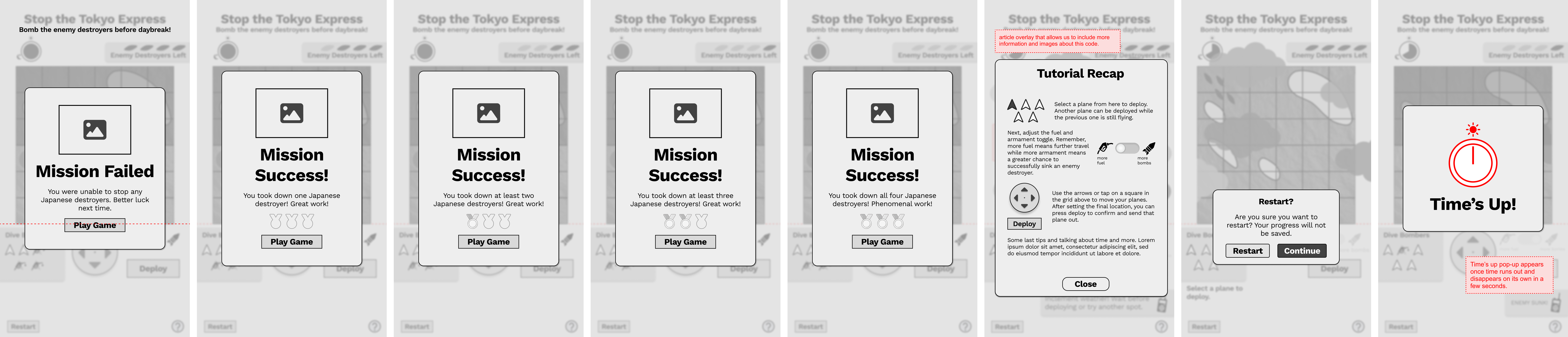
Scroll to see all 6 screens →
What changed
ver 1.2
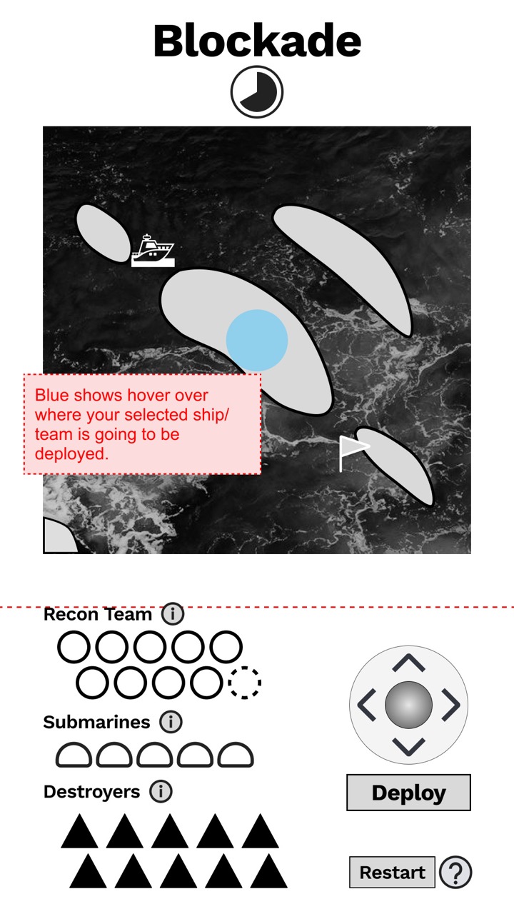
"Blockade" concept & tried photoreal, then dropped it for monochrome.
ver 2.1
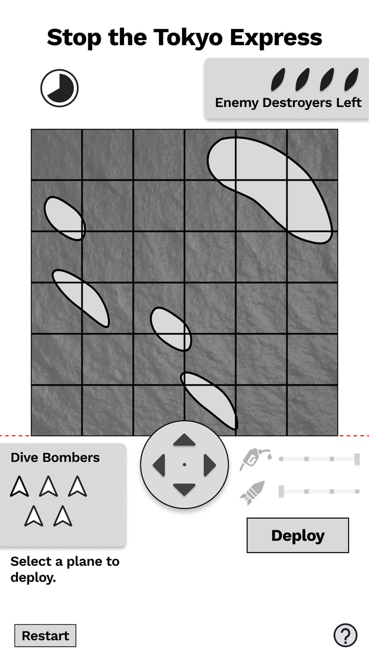
Pivoted to dive bombers for historical accuracy.
ver 3.3
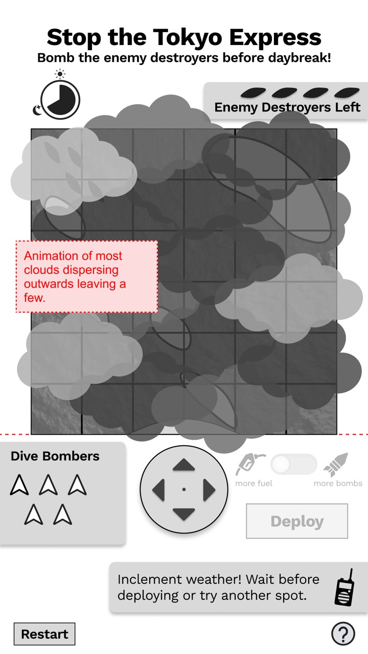
Inclement weather now blocks deployment for more interesting gameplay.
03
Bridging Design and Development
Dev Handoff
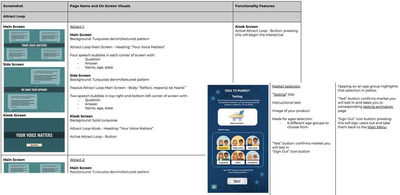
Beyond wireframes, I authored software breakdown documents for both games and 17 other concurrent projects. Each one captured every button state, transition, and trigger condition, tied directly back to a prototype frame.
These docs became more than a developer reference. They aligned copywriting, flagged inconsistencies across projects within the same museum, and gave every team — design, content, and engineering — one shared source of truth.
04
Playtesting
Mini case study
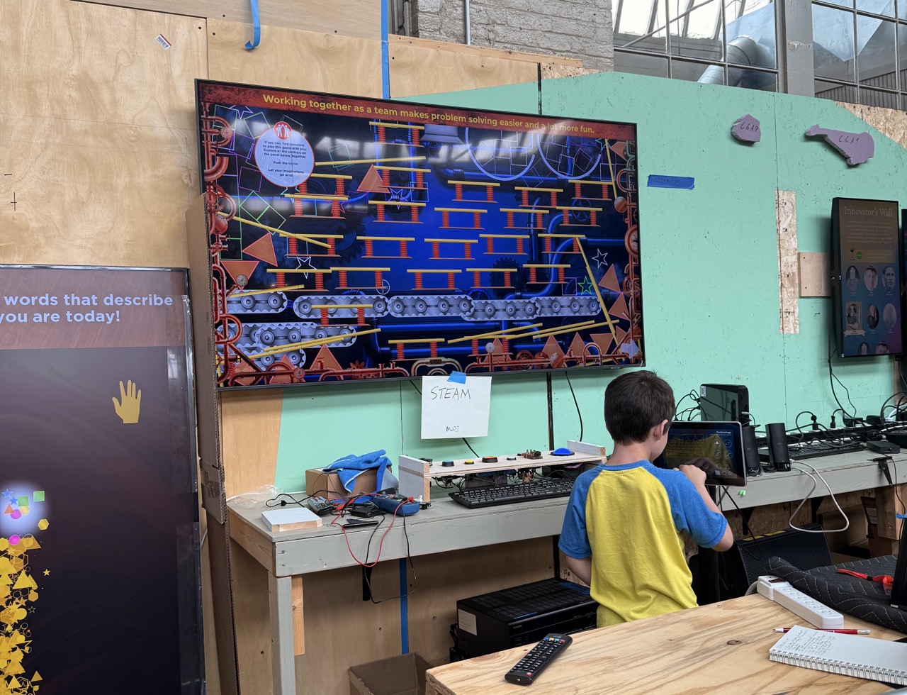
Visitor playtesting
Alongside this work, I ran in-person usability sessions with kids in the target demographic and client stakeholders on other museum interactives. This involved task-based play, observed navigation, and immediate feedback that validated design decisions against how real visitors actually engaged.
05
Reflection
What I'd Carry Forward
Adaptability Under Pace
Working in 1-week sprints improved my adaptability. The pace required me to prioritize changes, communicate clearly, and move quickly from feedback to implementation.
Cross-Team Communication
Cross-team communication is everything. When designing for physical museum interactives, collaboration between design, content experts, and developers is critical.
Brought to Life
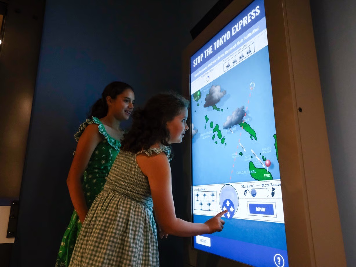
These exhibits are now installed and running in the reimagined George H. W. Bush Gallery at the National Museum of the Pacific War in Fredericksburg, TX — the same layout and interaction structure from this case study, brought to full color and texture by BPI's senior production team!